 Show all articles
Design drift before and after AI agents
Design drift is the gradual departure from a product's agreed design decisions. Coding agents can accelerate how those departures accumulate. The reason to care is familiar: people use the experience in front of them to decide how much confidence to place in the company behind it.
Why banks have columns
Why did so many banks build entrances with Greek columns and heavy stone walls?
You don't need columns to open a savings account. But the building was doing another job before anyone stepped inside. Its materials, proportions, and symmetry helped communicate stability. The message was something like: "We aren't going anywhere."
The Federal Reserve Bank of New York describes this architectural tradition as a way to convey strength, stability, and security to prospective depositors. The building helped make the promise.
A customer didn't need to study architecture to receive that message. They could simply feel that this was an established place to leave their money.
Your site or application communicates through design, too. Before someone understands your infrastructure, your support process, or how carefully you handle their data, they encounter the things they can see and use. Those details give them something to judge.
What design drift looks like
Imagine a customer moving from your homepage into signup, then through onboarding and onto a billing page.
On the homepage, the typography is clear and the primary action is easy to recognize. Signup uses a different button shape. Onboarding introduces another heading style. The billing form has unfamiliar spacing, different input borders, and an error message that looks unrelated to anything they have seen so far.
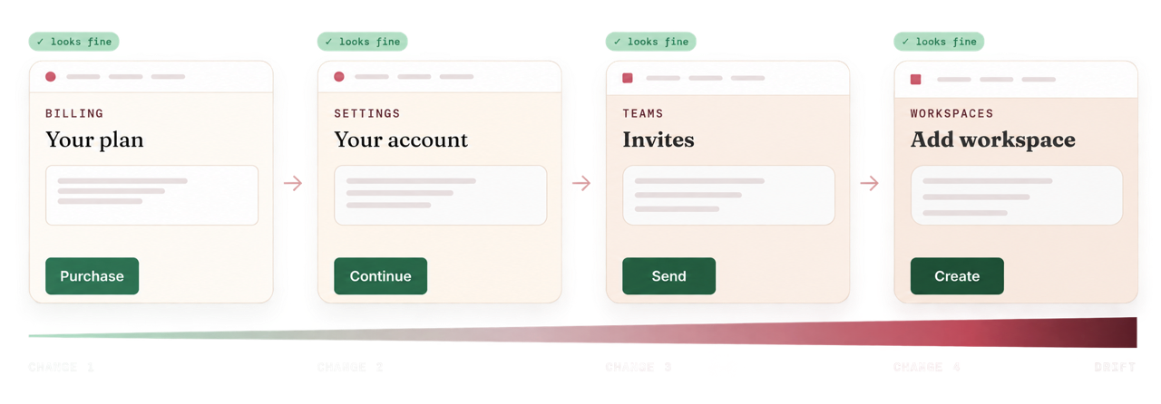
Each page might look acceptable in isolation. The journey feels assembled from separate products.
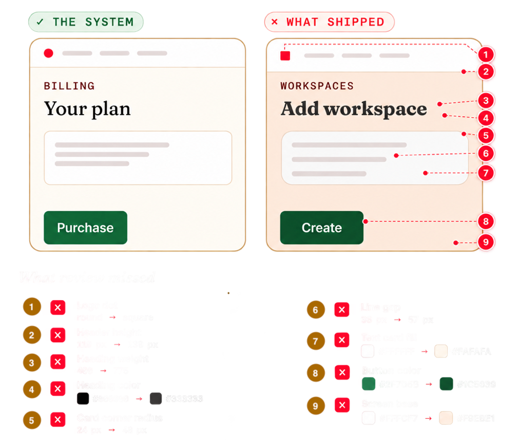
That is how design drift often becomes visible: decisions that once belonged together gradually diverge. A local color replaces a shared token. Someone rebuilds a component instead of reusing it. An exception becomes the example for the next page.
A deliberate redesign can introduce new patterns and improve the experience. Drift happens when differences spread without a shared decision about what they mean or where they belong.
What inconsistency asks of your customers
A familiar pattern lets people carry what they have learned into the next screen. When that pattern changes, they have to work out whether the meaning changed too.
Does this differently styled button still perform the main action? Does this field validate when they leave it, or after they submit? Is the unfamiliar payment screen still part of the same service?
Some differences create practical friction. Others can create a less specific feeling that the experience hasn't been fully considered.
Our argument is that those impressions can reach beyond the interface. A customer cannot inspect the care that went into your database or deployment process. They can see a form that looks unfinished. That may prompt an uncomfortable question: "If these details feel unattended, what else might be?"
A polished interface doesn't establish that software is secure or reliable. Those qualities need their own evidence. But the interface is often where a customer first decides whether to keep going long enough to find that evidence.
Research on website first impressions found that visual complexity and resemblance to familiar website patterns affected aesthetic ratings within 50 milliseconds of exposure. That finding concerns visual impressions, rather than a complete judgment of trust. It does help explain why design can influence an experience before someone has words for their reaction.
The brand cost we see in drift is the weakening of a recognizable experience. A logo may stay the same while the product around it sends increasingly mixed signals about the company behind it.
Before agents, drift grew through everyday work
Design drift was already a problem when people wrote every line of interface code.
A designer chose a pattern. An engineer implemented it. Another engineer copied an older version from a nearby screen. A deadline left a small difference unresolved. A later feature copied that difference because it was already in the product.
None of those steps required someone to stop caring about design. People worked with incomplete references, changing requirements, and limited time. Sometimes the approved component was hard to find. Sometimes the design covered the default state but left loading, errors, or narrow screens open to interpretation.
Review had its own limits. Finding a difference could mean opening the right page, reaching the right state, locating the current reference, and comparing the implementation. A small departure might survive simply because nobody encountered it during review.
The result was an accumulation of local decisions that the team eventually had to reconcile.
With agents, more decisions can happen between reviews
Coding agents change the pace and shape of that work. A short request can produce a new screen, then another request can revise its layout, add a state, or build a related flow.
Consider an illustrative example. A team asks an agent to add billing, then account settings, then a shorter onboarding flow. Each task produces a working page. Billing gets a new payment button. Settings gets a locally styled input. Onboarding gets a different heading scale.
The individual results may look polished. Together, they contain three interpretations of the same product. If a later task uses the billing page as its reference, that local button can spread further.
This can happen when the agent has enough context to solve the immediate task but lacks a clear agreement about which existing decisions to preserve. "Make it look like our app" leaves room for interpretation, especially when the app already contains conflicting examples.
More generated UI can also increase the amount a person needs to review. When implementation moves faster than the review process, small departures have more opportunities to pass through unnoticed.
Agents can help in the other direction, too. Given an accessible component library, explicit usage rules, and useful checks, they can reuse established choices and correct departures during implementation. The workflow around the agent matters.
What hasn't changed
The customer still encounters one product.
They don't know which screen came from an agent, which was written by an engineer, or which began as a prototype. They bring expectations from one part of the experience into the next.
The responsibility for making those parts work together still belongs to the team. Faster implementation makes that responsibility more pressing because there can be more decisions to examine before a release.
Consistency also needs judgment. A destructive action should be distinguishable from a routine one. An accessible flow may need a different interaction. A new requirement may expose a real gap in the system. Shared rules should make those changes deliberate and understandable.
Make the shared decisions part of the workflow
The practical response starts with giving the implementer a clear reference: the tokens to use, the components to reuse, the states to preserve, and the process for proposing something new.
Then check the implementation while the change is still being made. A specific finding, such as an input overriding an approved focus state, gives the engineer or agent something concrete to resolve. It also saves a reviewer from having to rediscover that difference by eye.
This is where we use a design contract in Grum. It makes reviewed design decisions available to the coding agent before it changes the UI, then checks the source for covered departures from that agreement. When a requirement needs a different design, the team has a review path.
Those checks support visual review, accessibility testing, and product judgment. A source check can identify a covered departure in code; it cannot establish that the live experience works well or that customers trust it.
The bank's columns helped communicate a promise of permanence. In a digital product, care shows up in smaller, repeated ways: familiar controls, clear hierarchy, predictable behavior, and an experience that holds together from the first page to the last.
Your users won't inspect every decision behind your product. They will experience whether those decisions belong together.


