 Show all articles
Why agent testing won't fix your visual UI
Manual testing, automated testing, and now teams of testing agents. Each step made QA faster. None of them can tell you whether your product still looks like your product.
Testing has moved in clear steps. People clicked through the app by hand. Then scripts ran the same checks on every build. Now vendors pitch multi-agent testing: a planner agent, a test-writing agent, a runner, a bug sorter, and a release gate, all sharing context so no one has to coordinate them in Slack.
Adoption is moving fast. The ThinkSys QA Trends Report 2026 expects 80% of software teams to adopt AI-driven testing. Results are not keeping pace: S&P Global found that 42% of companies abandoned most of their AI initiatives in 2025, up from 17% the year before.
That is real progress for behavior. Does the form submit? Does checkout total correctly? Does the API return the right error? Agents are good at those questions because each one has a right answer.
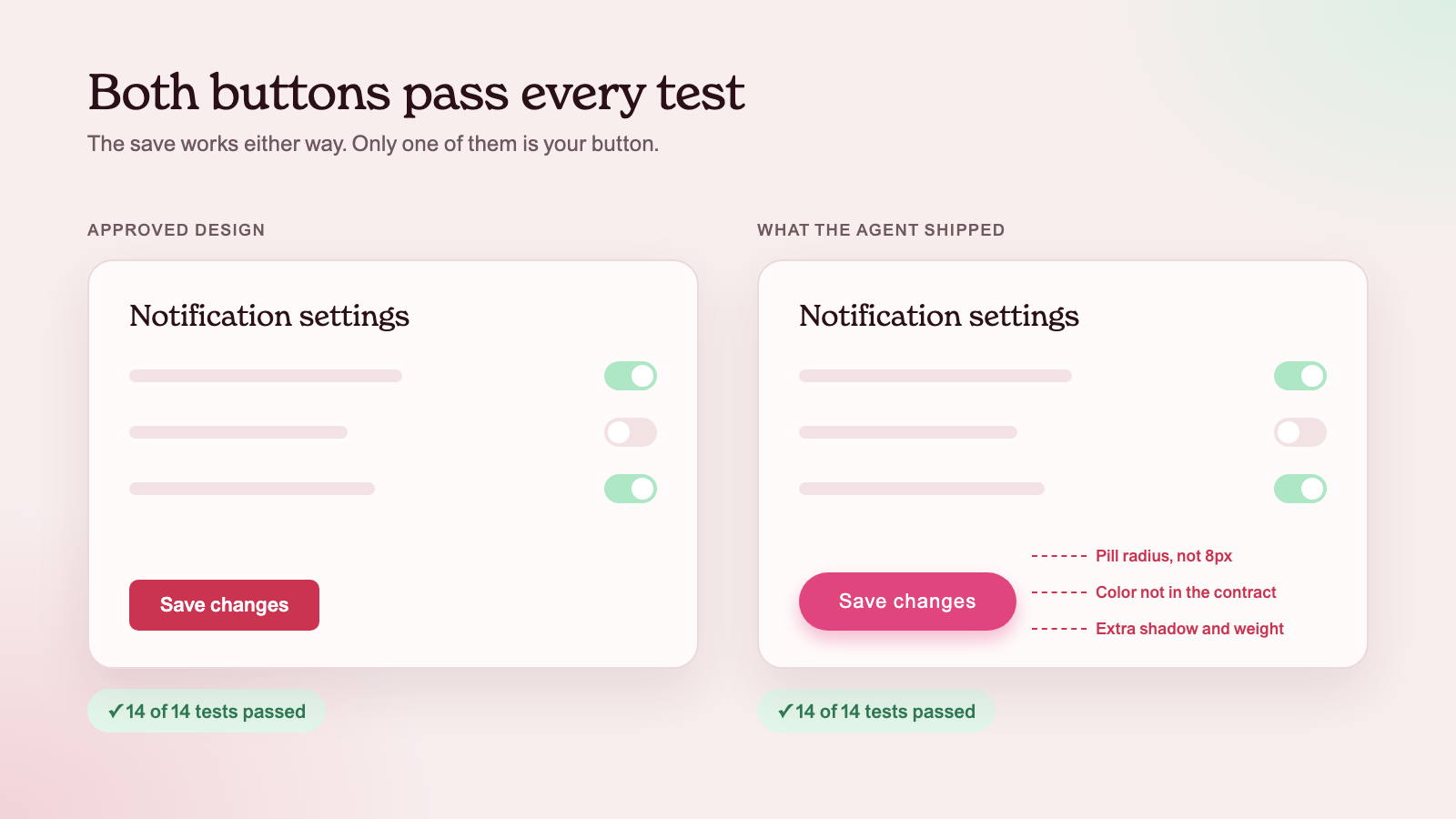
Visual quality is different. A button with the wrong radius, a heading in the wrong weight, or a card with a hand-picked gray passes every functional test. Adding more agents to the test suite does not change that.
Manual, automated, agent: what each one fixed
Each step in testing solved the bottleneck the last one left behind.
- Manual testing: a person checks the product
- A tester can notice anything, including "this looks off." But it is slow, it depends on who is looking, and it does not keep up with daily releases.
- Automated testing: scripts check the same thing every time
- Scripts are fast and repeatable. They only check what someone wrote down, and someone still has to write, run, and maintain them.
- Agent testing: agents plan, write, run, and sort tests
- Agents take over the coordination. They read requirements, generate cases, retry flaky runs, and score a release. The human work shrinks to reviewing what they report.
Notice what each step optimizes: speed and coverage of checks that have a clear pass or fail. That is exactly the part of quality that visual issues sit outside of. Even the ThinkSys report, which is bullish on AI testing, notes that complex UX testing still needs human review.
Where agent testing stops
"Looks right" is not a test assertion
A test needs an expected result. For behavior, the requirement gives you one. For visuals, the expected result is a set of decisions your team made: this blue, this radius, this spacing, this button for the main action. If those decisions are not written down somewhere a tool can read, no agent can test against them. It can only guess.
Agents checking agents share the same blind spot
More and more UI is now written by coding agents. When another agent reviews that work, it starts from the same missing information. If the coding agent did not know your approved button, the testing agent does not either. Both can agree that a one-off button "looks fine."
Screenshot diffs flag too much and explain too little
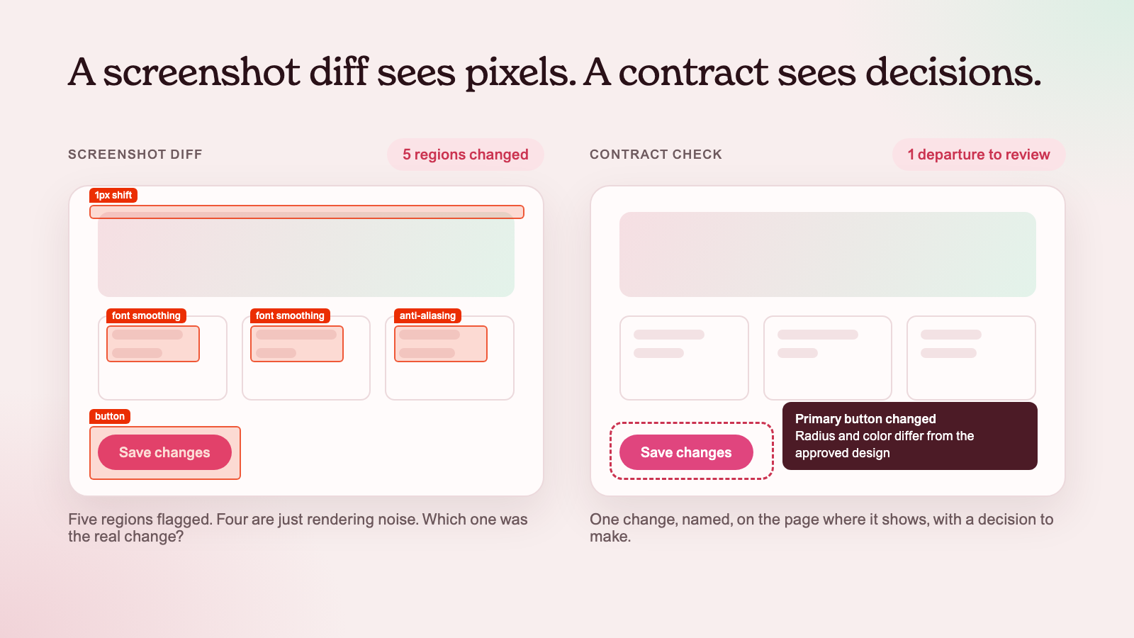
Visual regression tools compare screenshots pixel by pixel. That catches change, not intent. Fonts, browsers, and hardware render slightly differently, which Playwright's own docs call out for its screenshot comparisons. A diff can tell you something moved. It cannot tell you whether the move was an approved redesign or a hardcoded color an agent invented.
The UI is not built the same way twice
Ask an agent for a settings page twice and you may get two different buttons. Both work. Both pass. Over a few weeks, the product collects small differences that no single test was ever going to fail.
What visual quality needs instead
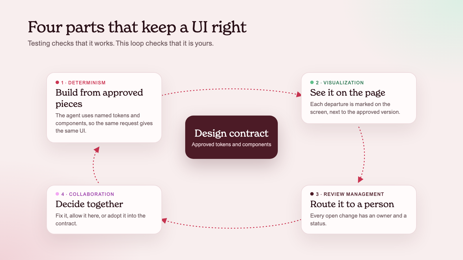
Testing still matters. It just needs to sit next to four things that are about agreement, not only checking.
1. Collaboration: agree on what "right" means
Designers, engineers, and product people need one shared answer to "which button is the main action?" and "which gray is the border?" That answer has to live where the code is written, so a person or an agent can read it before they build, not after someone complains.
2. Review management: route each departure to a person
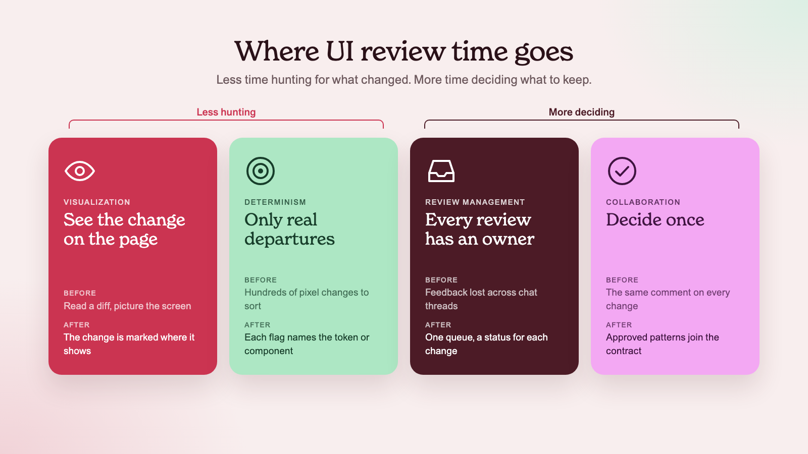
Some differences are mistakes. Some are new ideas worth keeping. A team needs a clear path for both: fix it, approve it as an exception, or adopt it as a new pattern. And it needs to know which reviews are open, so a departure does not get lost in a chat thread.
3. Visualization: show the change, not just report it
"Line 42 uses a raw hex color" is hard to judge. Seeing the page with the change outlined is easy. Reviewers make faster, better calls when they look at the actual screen, next to the approved version.
4. Determinism: build the UI from fixed, named decisions
If every color, size, and button comes from a named token or an approved component, the same request produces the same result. That turns a fuzzy question ("does this look right?") into a clear one ("does this use the approved pieces?"), which a tool can actually check.
One button, four parts
Say an agent adds a "Save" button to a new settings page. Every functional test passes: the button saves. Here is how the four parts handle what the tests miss.
- Determinism. The agent reads the approved Primary button and its tokens before writing code, so the default path produces the right button.
- Check. If the agent overrides the radius anyway, a source check flags that line as a departure from the agreement.
- Visualization. The reviewer sees the page with the new button marked, next to the approved one.
- Review and collaboration. The team decides: change it back, approve it for this page, or adopt it as a new shared pattern. The decision is recorded, so the next agent knows the answer.
None of these steps replaces testing. They cover the part of quality that a test suite, with or without agents, was never designed to own.
How we handle it in Grum
Grum keeps a design contract for each repository: the approved tokens, buttons, and inputs, plus the rules for using them. Coding agents read it before they change the UI, and check their work for drift before they finish.
When something falls outside the contract, it goes to review with the page it appears on, so the team can see it and decide. Approved patterns become part of the contract, and the next change starts from them.
A source check has limits. It can show where code leaves the agreement. It does not prove a live page looks right, and it does not replace accessibility testing or product judgment. That is the point: visual quality is a team decision, and the tools should help the team make it, not pretend to make it for them.
Want to see Grum on your own code? Book a demo and we'll walk you through it.
Request early access

